

Instructions to make a list view for blog posts: https://quiroz.co/modify-the-divi-blog-fullwidth-layout/
Basically, do a blog block, With Excerpts, full screen layout, and have this css in your site.
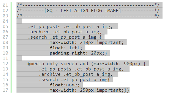
Here is the CSS:
/*------------------------------------------------*//*--------[GQ - LEFT ALIGN BLOG IMAGE]------------*//*------------------------------------------------*/.et_pb_posts .et_pb_post a img, .archive .et_pb_post a img, .search .et_pb_post a img {max-width: 210px!important;float: left;padding-right: 20px;}@media only screenand (max-width: 980px) {.et_pb_posts .et_pb_post a img, .archive .et_pb_post a img, .search .et_pb_post a img{float:none;max-width: 250px!important;}}
Should look like this:
Here is Custom CSS for a floating header and centered menu
/*------------------------------------------------*/
/*--------[GQ - LEFT ALIGN BLOG IMAGE]------------*/
/*------------------------------------------------*/

    .et_pb_posts .et_pb_post a img,
    .archive .et_pb_post a img,
    .search .et_pb_post a img {
            max-width: 210px!important;
            float: left;
            padding-right: 20px;}

    @media only screen and (max-width: 980px) {
        .et_pb_posts .et_pb_post a img,
        .archive .et_pb_post a img,
        .search .et_pb_post a img{
            float:none;
            max-width: 250px!important;}}

@media only screen and (max-width: 980px) {
#logo {
min-height: 100px;
}
}
@media only screen and (min-width: 981px) {
#logo {
min-height: 120px;
}
}

#top-menu, .et-menu, nav#top-menu-nav, nav.et-menu-nav {
    float: none!important;
    text-align: center;
}
#et-top-navigation {
    width: 100%;
}